By using our site, you agree to our Cookie Policy
Accept

Information overload? Get the picture
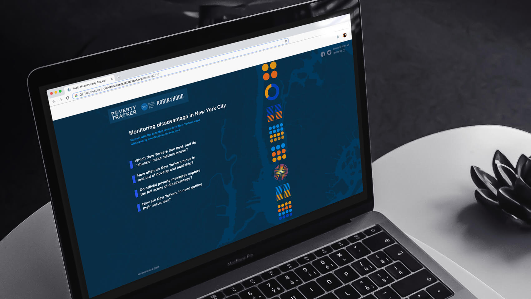
Data can be overwhelming, and those who can’t see it often don’t get it. There’s nothing quite like a punchy visual to synthesize large amounts of information. A chart can encapsulate everything from buying trends to survey results, presenting in one elegant image what would otherwise take reams of words to convey.
Want to see profit projections over time, stock returns with interactive components, changes in the air quality index? Look no further. We’ve got you covered.
We’ve produced data visualization work for numerous clients, including Rightful.com, XBTO.com, UpswingHealth.com, and eMindful. eMindful is an enterprise service offering live and recorded online mindfulness training programs, as well as tools to facilitate mental health and wellness. Our interface and interactions let users set goals, track their progress, and see how far they’ve come along any number of metrics—stress patterns, healthy eating, etc. An easily digestible pie chart shows how much of any given day was devoted to rest and activity, and how much was eaten up by stress.
Infographics bring order and clarity to what could otherwise be unwieldy and overwhelming. Great web designers should aim for no less.
Case studies are available upon request.


