


By using our site, you agree to our Cookie Policy
Accept

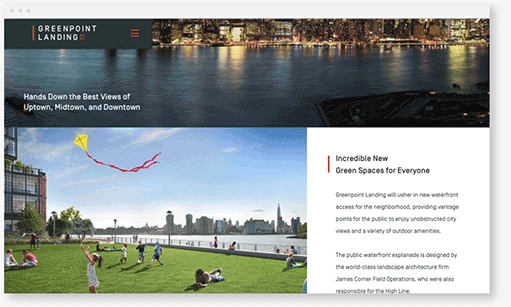
Suit your site to every screen
With more than half of the traffic on the internet now generated by mobile browsing, optimizing your site for mobile is more important than ever. Case in point: Google now ranks mobile-friendly sites more highly than their desktop-bound counterparts.
In short, if you want to be competitive, mobile is no longer a desirable addition. It’s a base requirement. Responsive websites look good and work well in different browsers and on different mobile and tablet devices, regardless of window or screen size. Every website we create makes the grade.
Look flawless on all devices.
Responsive web development Work
From our blog