The CSS spec is continuously evolving, giving developers increasingly granular control of page layout, as well as the appearance and behavior of individual elements. Long gone are the cowboy days of the early web, when developers were forced to turn to an image editor for creating drop shadows and rounded corners, or JavaScript for animation. These days, the CSS spec provides simple declarative methods for all of this—and so much more.
I love experimenting with newer CSS features and testing what can be achieved with pure CSS. So, without further ado, today in the CSS lab, let’s explore a simple hover effect using CSS linear-gradients and background-clip. Run the pen below, and then let’s dive into the code!
See the Pen Shiny Hover Effect by Sarah (@sarahquigley) on CodePen.
You’ve seen the pen—now on to the code! First off, let’s set up the basics of our styled text:
This styling is largely for flavor, using flexbox to center white text horizontally and vertically on a dark background with some typographical flair added by Google Fonts.
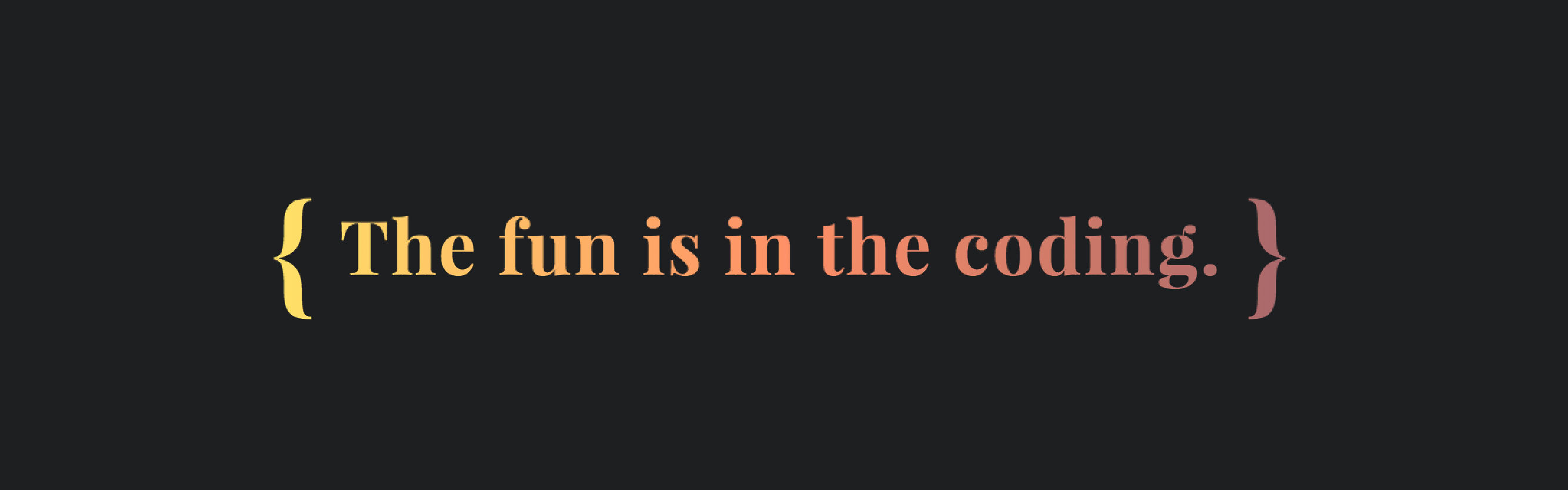
At this stage, our CSS experiment looks like the image above. But where’s our .shiny hover effect? Let’s start building it!
Add a linear gradient background to the .shiny element. (To see the gradient in full, take a peek at the image below.) Using the background size property, this gradient’s width is set at four times the .shiny element’s width. Thus the white portions, sandwiching the gradient and occupying 25% of its length, will cover 100% of the .shiny element’s width.
On hover, update the background-position property and animate it using a CSS transition. This transition moves that gradient from left to right over the text, revealing the colors hidden in the middle of the gradient (hence that shine!). The transition is added to the :hover pseudo-class of the .shiny element, as it’s preferable for the transition to run only when you actively hover over the element (not when you stop hovering).
But something is horribly wrong! Our experiment now looks somewhat unsatisfyingly like this…
…and on hover like this:
Time for the final touches. To “clip” the gradient background to the text, add the background-clip property with a value of text.
To put the final touches on our code, we need to address every web developer’s favorite question—browser support. Background-clip: text is not yet part of the CSS standard (thus the need for a prefix). Support is good in all browsers—except, of course, for IE. For an elegant fallback, add a new text color on a hover and a (slightly less shiny) transition on that color.
One problem: The text color property hides our clipped background. What’s the solution? We override the color property with a transparent text-fill-color. Text-fill-color has similar browser support to background-clip: text—using it allows our clipped background gradient to shine through browsers that do support background-clip: text but also ensures an elegant fallback to conventional text color on browsers that do not.
Thanks for joining me in the CSS lab. Luckily there were no explosions today. (Maybe next time.) Hope to see you at the next session—but in the meantime, perhaps you’ll find a place for this shiny little hover effect in a project or two?
This is the first in a series of articles in which I’ll explore simple, fun effects that can be achieved with pure CSS. Stay tuned for more!